
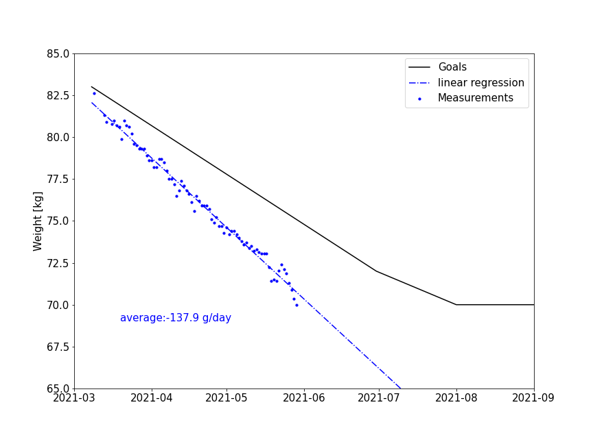
I lost 13 kg in 3 months
Why I need to lose weight
I haven’t really took care of my body in my entire life. After turning 30, it suddenly came to me that a healthy body is much more precious and important then any other things. I have been chubby since childhood and my BMI was as high as 26. After reading some literature, I realized that obesity dramatically increase the chance of diseases by many times. It is time to make a move. I made up a plan and would register everything I ate and keep track of my body weight. I have been using an excel file and you can found a download link in the following section.
13 kilograms in 3 months
After 3 months, I think I succeed at least in the first stage. I have lost 13 kg and feel much better than before. I need less sleep and can get up 6:00 in the morning. It feels more energetic during the day even though I have been eating less. It is very surprising that losing weight is not that difficult.
In the beginning stage I did not exercise much. I was trying to reduce the meals and replace the dinner with pure vegetables. In the middle stage, I start to exercise. I started from morning 3 km and two times a week, gradually increasing to 5 km and three times a week. I also went to the gym two times a week. So working days I would exercise 45 minutes every morning. In the last three weeks, I begin to follow “intermittent fast” that I only eat during 08:00-13:00. During the rest time of the day, I would only drink water, tea and black coffee. It shows in the figure, this IR is very effective.
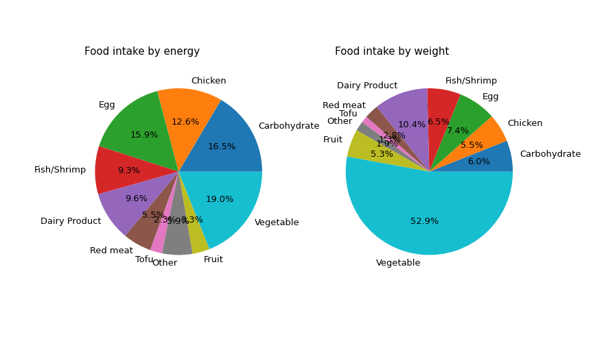
I have intentionally reduced my carbohydrate intake and replaced rice/noodle/pasta with sweet potato. I only eat a slice of bread (30g) for breakfast. What surprises me is that carbohydrate still accounts for 16% of my energy intake. Carbohydrates comes with two much energy with too little space in the stomach. It is also easy to feel hungry after eating carbohydrates as the main energy supply as they are so easy to be digested.
Resource
You can use this link to download my excel file that keeps track of food intake and exercise.
Code
Code is provided here. Some modifications might be needed to process that data.
read input
# import library
from matplotlib.transforms import Transform
import numpy as np
import pandas as pd
import matplotlib.pyplot as plt

# read in dataset
weight_df = pd.read_excel("2021 Goalsxlsx.xlsx", sheet_name="weight")
food_df = pd.read_excel("2021 Goalsxlsx.xlsx", sheet_name="food db")
intake_df = pd.read_excel("2021 Goalsxlsx.xlsx", sheet_name="food record")
generate the weight figure
# weight curve fit function
def weight_fit():
    weight_measure = weight_df[['date.1', 'Measurement (kg)']].copy()
    weight_measure.dropna(axis = 'index', how='any', inplace = True)
    # make a correlation between index and measurements.
    z = np.polyfit(weight_measure.index,
                weight_measure['Measurement (kg)'],
                deg = 1)

    slope = z[0]

    # return a 1d fit function
    return np.poly1d(z), slope

# new figure about weight loss curve
def line_plot(ifChinese = False):
    # get the fit function
    fit_function, slope = weight_fit()

    # lables two languages
    if ifChinese == True:
        plt.rcParams['font.family'] = 'SimHei'
        y_lable = '体重 [kg]'
        legends = ['目标值', '测量值拟合', '测量值']
        text_lable = "平均:{:.1f} g/day".format(slope*1000)
    else:
        plt.rcParams['font.family'] = 'DejaVu Sans'
        y_lable = 'Weight [kg]'
        legends = ['Goals', 'linear regression', 'Measurements']
        text_lable = "average:{:.1f} g/day".format(slope*1000)


    fig, ax = plt.subplots(1,1)
    fig.set_size_inches(12,9)
    ax.plot(weight_df['date'], weight_df['Goal (kg)'], 'k')
    ax.scatter(weight_df['date.1'], weight_df['Measurement (kg)'], color = 'b', s = 10)


    fit_y_value = fit_function(weight_df.index)

    ax.plot(weight_df['date.1'], fit_y_value,  color = 'b', ls= '-.')
    ax.text(0.1,0.2, text_lable,
        transform=ax.transAxes,
        fontsize = 15,
        color = 'b')

    ax.set_xlim([pd.Timestamp(2021,3,1), pd.Timestamp(2021,9,1)])
    ax.set_ylim([65,85])

    ax.legend(legends,fontsize = 15)

    ax.set_ylabel(y_lable, fontsize = 15)
    ax.tick_params(axis='both', labelsize= 15)

    if ifChinese == True:
        plt.savefig('line_chinese.png')
    else:
        plt.savefig('line.png')

# draw pictures
line_plot(ifChinese = True)
line_plot()
Generate the figure of food intake
# figures
def pie_chart(df_kcal, df_kg, ifChinese = False):
    fig, (ax1, ax2) = plt.subplots(1,2)
    fig.set_size_inches(12,7)

    # show sequence
    new_index = ['Carbohydrate', 'Chicken', 'Egg', 'Fish/Shrimp', 'Dairy Product', 'Red meat',
            'Tofu', 'Other', 'Fruit', 'Vegetable']
    chinese = ['碳水', '鸡肉', '蛋', '鱼/虾', '奶制品', '红肉',
            '豆腐', '其它', '水果', '蔬菜']
    df_group_kcal = df_kcal.reindex(new_index)
    df_group_kg = df_kg.reindex(new_index)

    if ifChinese == True:
        plt.rcParams['font.family'] = 'SimHei'
        pie_lables = chinese
        title1 = '摄入食物能量分解'
        title2 = '摄入食物重量分解'
    else:
        plt.rcParams['font.family'] = 'DejaVu Sans'
        pie_lables = new_index
        title1 = 'Food intake by energy'
        title2 = 'Food intake by weight'

    # by energy
    ax1.axis('equal')
    ax1.pie(df_group_kcal['Calorie (kcal)'],
            labels = pie_lables,# df_group_kcal.index,
            autopct='%1.1f%%',
            textprops={'fontsize': 13})

    ax1.text(0.05, 0.95, title1,
            fontsize = 15,
            transform=ax1.transAxes)

    # by quantity
    ax2.axis('equal')
    ax2.pie(df_group_kcal['quantity'],
            labels = pie_lables, # df_group_kg.index,
            autopct='%1.1f%%',
            textprops={'fontsize': 13})
    ax2.text(0.05, 0.95, title2,
            fontsize = 15,
            transform=ax2.transAxes)

    if ifChinese == True:
        plt.savefig('piechart_chinese.png')
    else:
        plt.savefig('piechart.png')

# Join two tables
food_df.rename({'Item':'food', 'Calorie (kcal)': 'Calorie (kcal) per portion'}, axis =1, inplace=True)
df_join = intake_df.join(food_df.set_index('food'), on = 'food', )

# by calorie
df_group_kcal = df_join.groupby('Type').sum()

# by kg, some units are by 'piece'. need to drop these rows
df_join.unit.value_counts()
df_join_drop = df_join.loc[df_join['unit']!='piece']
df_group_kg = df_join_drop.groupby('Type').sum()

# draw figures
pie_chart(df_group_kcal, df_group_kg, ifChinese = True)
pie_chart(df_group_kcal, df_group_kg)
generate the figure of top ten food
# Top ten What I eat most by weight / calories
df_food_kg = df_join.groupby('food').sum().sort_values(by='quantity', ascending=False)
df_food_kcal = df_join_drop.groupby('food').sum().sort_values(by='Calorie (kcal)', ascending=False)

df_food_kg.reset_index(inplace=True)
df_food_kcal.reset_index(inplace=True)

# figures
def bar_chart():
    plt.rcParams['font.family'] = 'DejaVu Sans'
    fig, (ax1, ax2) = plt.subplots(2,1)
    fig.set_size_inches(8,12)
    plt.subplots_adjust(hspace=0.3)

    nr = 10
    x=np.arange(nr)

    # The first picture
    y_kcal = np.array(df_food_kcal[0:nr]['Calorie (kcal)'])
    y_kcal_rel = y_kcal/y_kcal[0]

    x_kcal_lable = df_food_kcal[0:nr]['food'].tolist()
    ax1.bar(x, y_kcal_rel)
    ax1.set_xticks(x)
    ax1.set_xticklabels(x_kcal_lable, rotation=60)
    ax1.set_ylabel('energy ratio', fontsize = 15)
    ax1.text(0.6,0.9, 'Top ten by Calories',
            transform=ax1.transAxes,
            fontsize = 15)
    ax1.tick_params(axis='x', labelsize= 12)


    # The second picture
    y_kg = np.array(df_food_kg[0:nr]['quantity'])
    y_kg_rel = y_kg/y_kg[0]
    x_kg_lable = df_food_kg[0:nr]['food'].tolist()
    # ax1.axis('equal')
    ax2.bar(x, y_kg_rel)
    ax2.set_xticks(x)
    ax2.set_xticklabels(x_kg_lable, rotation=60)
    ax2.set_ylabel('weight ratio', fontsize = 15)
    ax2.text(0.6,0.9, 'Top ten by Weight',
            transform=ax2.transAxes,
            fontsize = 15)
    ax2.tick_params(axis='x', labelsize= 12)
    plt.savefig('top10food.png')

bar_chart()